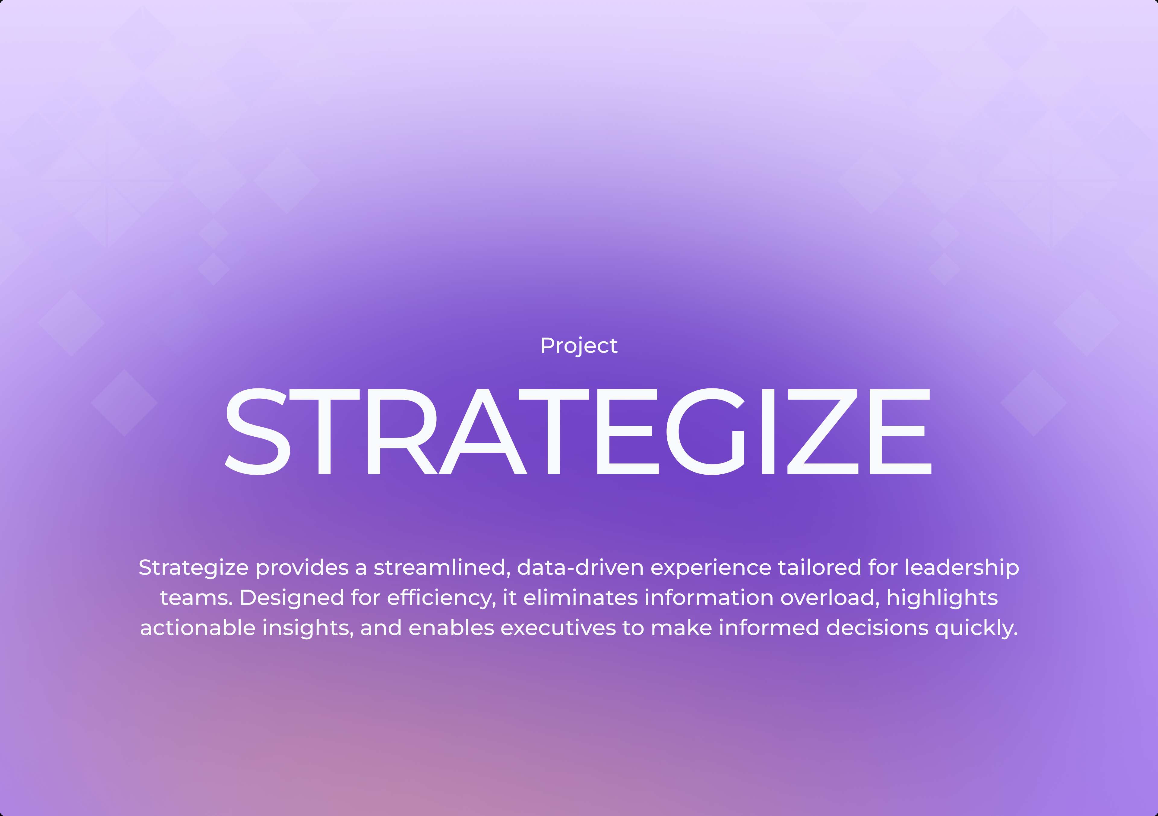
Strategize
Enhancing executive engagement through intuitive design for a business intelligence application used by government organizations and enterprises.
Timeline
3 months
Role
UI/UX Designer
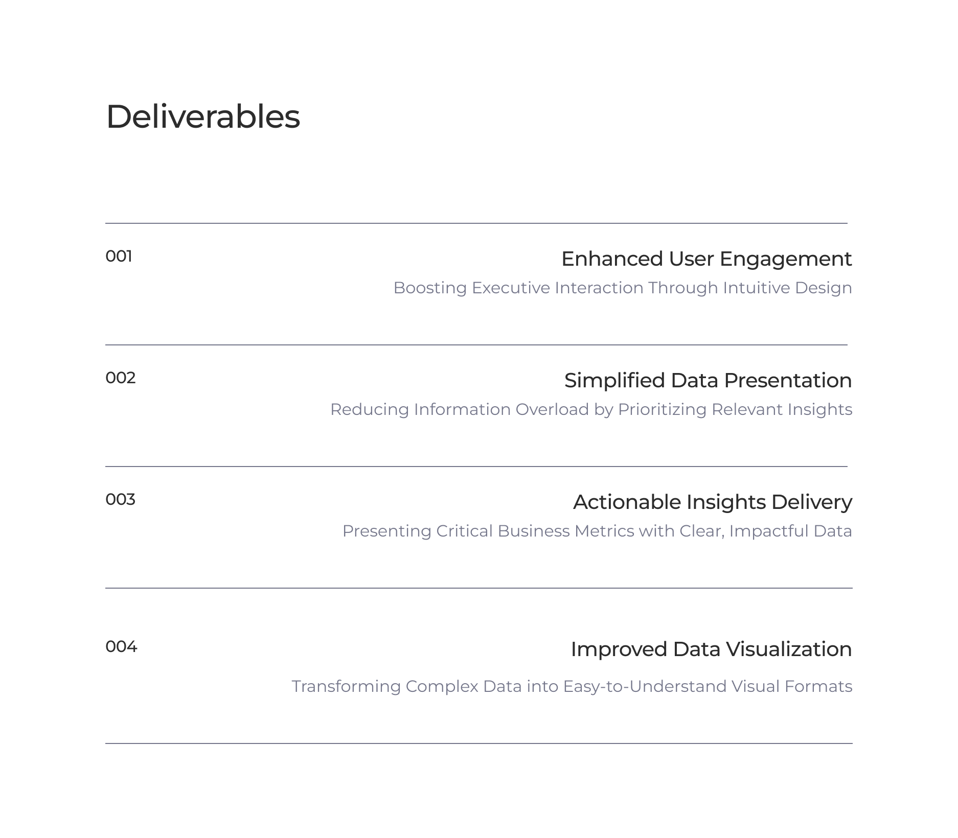
Deliverables
UX Research, UI Design, Interactive Prototypes
Due to NDA restrictions, I can't display all designs and details from this project. If you're interested in learning more, feel free to contact me.
Overview
The existing application overwhelmed users with excessive data and lacked clear prioritization, leading to disengagement from executives. The interface needed to be simplified, focusing on key data to support quick, effective decision-making and increase usage. The target audience included high-ranking individuals such as CEOs, COOs, CFOs, Directors, and VPs who are responsible for overseeing major business units and making strategic decisions.
The Challenge
Before embarking on this design journey, the parent application was cluttered with overwhelming data, making it difficult for leaders to extract meaningful insights. Engagement dropped as executives struggled with complex navigation and static visuals that failed to capture attention. User research revealed a 60% drop in user engagement, 70% underutilized dashboards, and a 55% user frustration rate, with users spending more than 2 minutes on tasks that should be simpler.
User Insights
Direct feedback from stakeholders revealed key pain points and opportunities for improvement.
"I don't have time to shift through all this data. We need something more streamlined."
Chief Strategy Officer
"It will be fantastic if I can access what I want at a place rather than browsing through workspaces and dashboards."
Operations Director
"We need a streamlined design to prioritize key data. The current system is overwhelming."
Executive Director
"I really don't know why I am seeing these unnecessary items. We need better organization."
Head of Strategy
The Process
User Research
We began by talking to clients to understand their pain points. Common feedback included: 'I don't have time to shift through all this data,' 'It will be fantastic if I can access what I want at a place rather than browsing through workspaces and dashboards,' 'We need a streamlined design to prioritize key data,' and 'I really don't know why I am seeing these unnecessary items.'
Problem Analysis
Through careful research, analysis of user issues, and understanding business needs, we shaped the structure of the new application to address key challenges. We identified the need for simplified data presentation, actionable insights delivery, improved data visualization, and time-saving navigation.
Visual Design
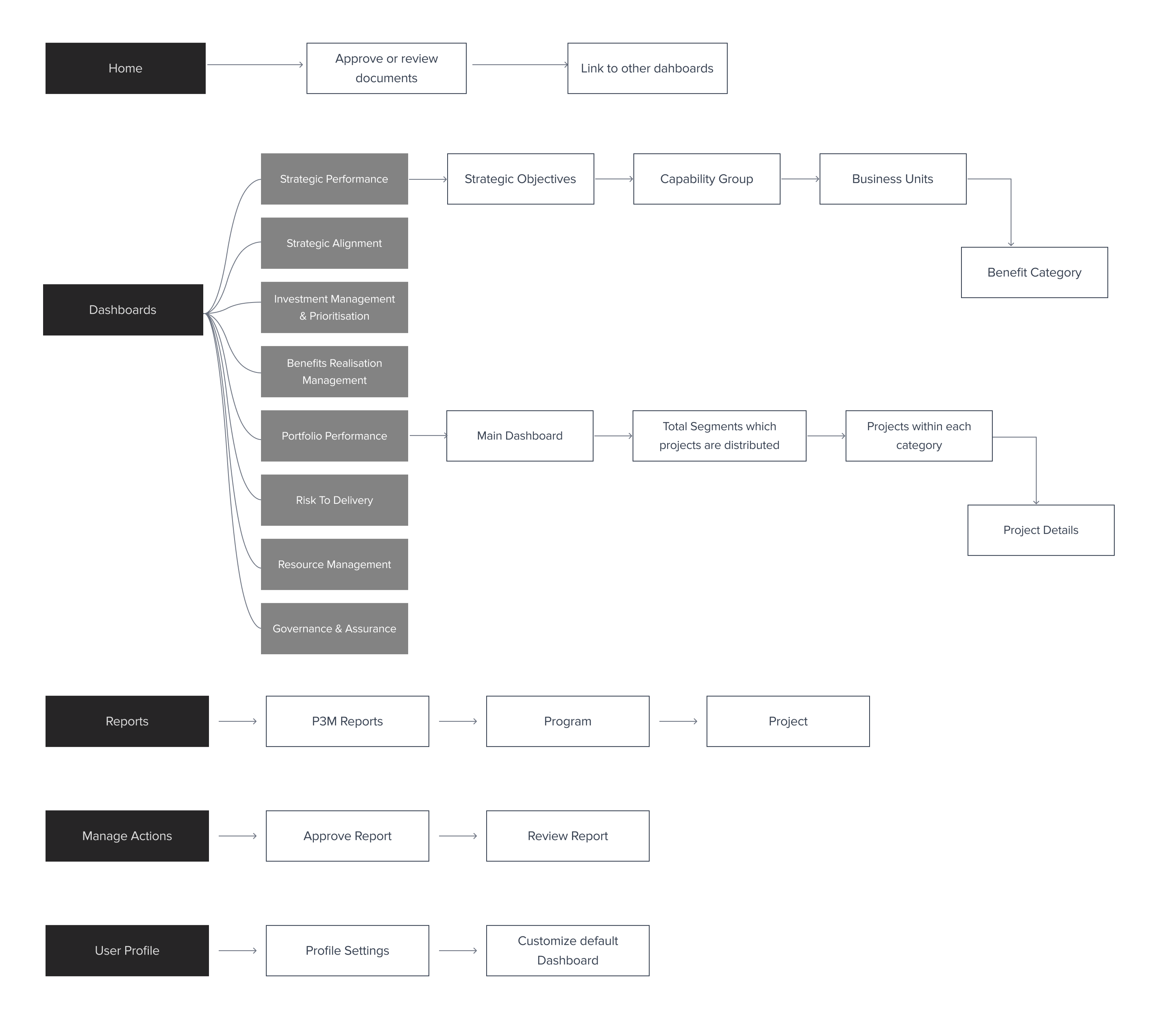
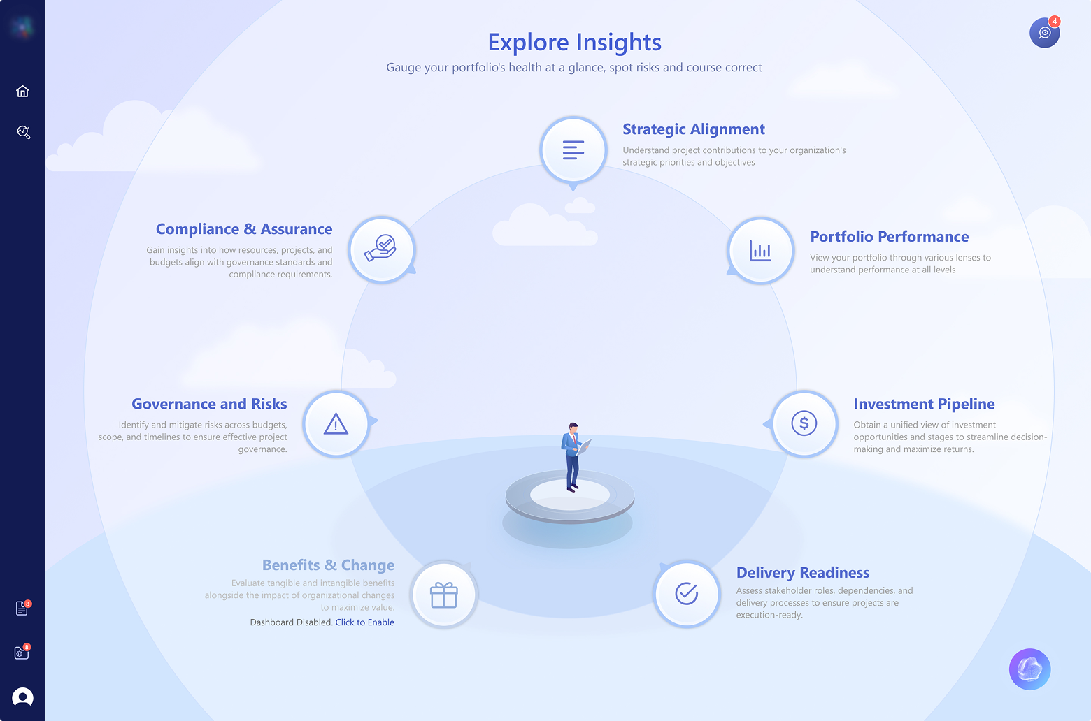
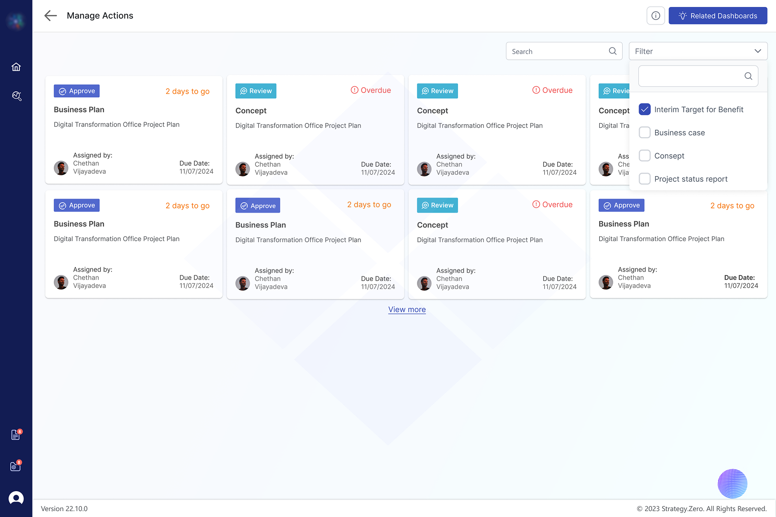
As a solution, we carefully selected the most crucial dashboards that empower users to analyze and dive deeper into the data. These relevant, simplified dashboards were tailored for the executive experience. In addition, an Action Center was integrated for executives to easily review and approve requests and reports.
Interaction Design
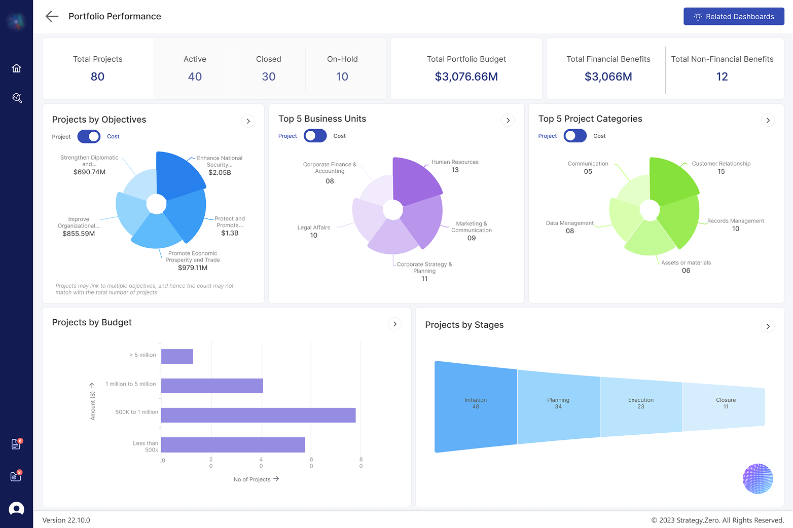
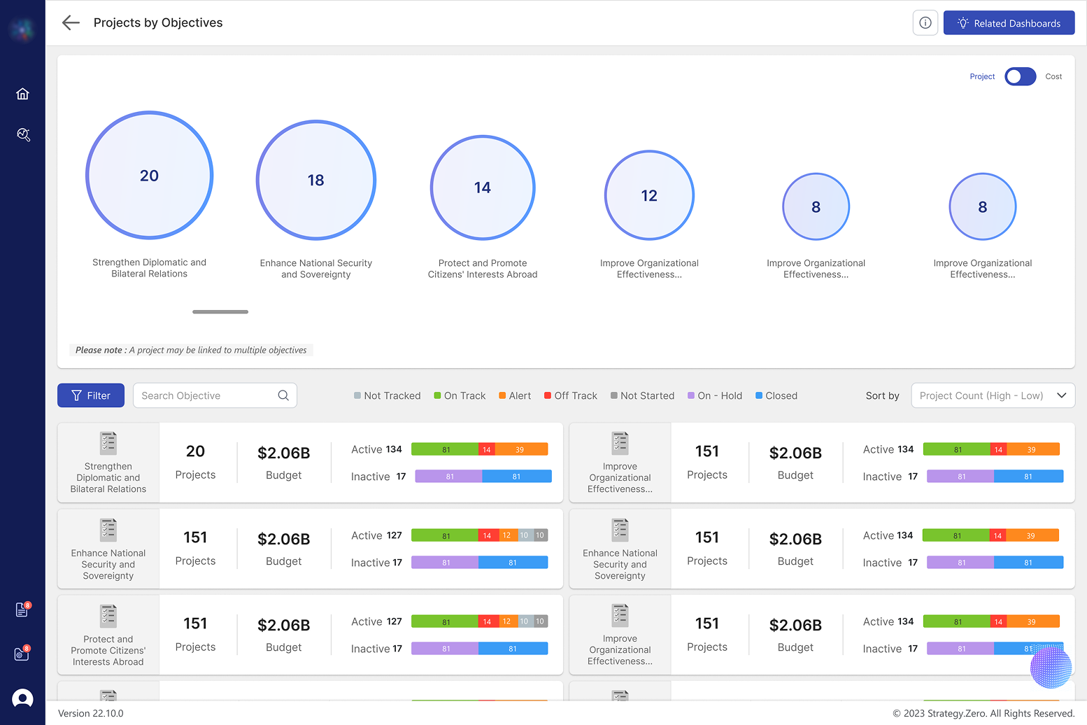
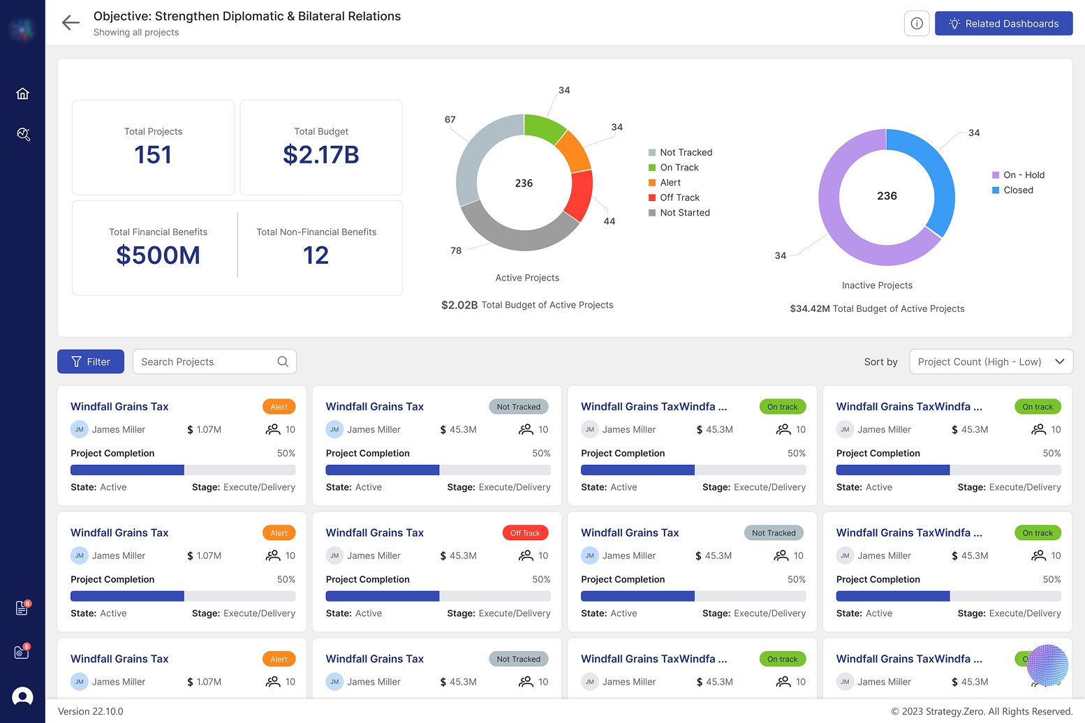
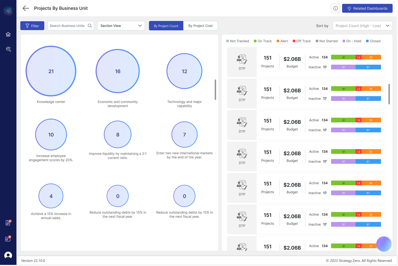
For the Portfolio Performance Dashboard, I condensed the content into key points with an interactive overview displaying charts like 'Top 5 Projects by Objectives,' 'Top 5 Business Units,' and 'Projects by Budget.' Each chart element acts as a filter for more specific project data, with four levels of insight from high-level overview to individual project reports.
The Solution
The redesigned application features a streamlined, executive-friendly experience that drives engagement, simplifies data insights, and supports better decision-making. Key features include: 1) Portfolio Performance Dashboard with interactive charts and multi-level insights, 2) Action Center for managing approvals and viewing reports, 3) Tailored Menu Experience with customizable dashboard options, 4) Redesigned Power BI dashboards for visual consistency, and 5) Dedicated feedback screen for continuous improvement.
Results & Impact
User Engagement
Implemented interactive, visually appealing dashboards with layered navigation, encouraging deep dives into specific data points.
Data Presentation
Prioritized insights and reduced clutter make essential data clear and accessible.
Data Visualization
Redesigned Power BI dashboards offer visually consistent and intuitive displays with better data visualization techniques.
"So far, so good. People are liking it - this is the initial feedback after testing with users."
Project Feedback
Initial Testing
Key Takeaways
We transformed a complex and data-heavy application into a streamlined, executive-friendly experience that drives engagement, simplifies data insights, and supports better decision-making. The project achieved all deliverables: enhanced user engagement through interactive dashboards, simplified data presentation with prioritized insights, actionable insights delivery with custom report views, improved data visualization with consistent displays, and time-saving navigation with clear information hierarchy.
Visit Live Project